| css | ||
| examples | ||
| fonts | ||
| images | ||
| js | ||
| index.html | ||
| README.md | ||
| themes.yaml | ||
| VERSION | ||
Dashie
Dashie is a simple personal dashboard with themes and multiple pages, generated on the fly from the YAML configuration files.
There is no multiuser support right now.
A shoutout to Dashy, https://dashy.to/, which Dashie is visually heavily inspired by.
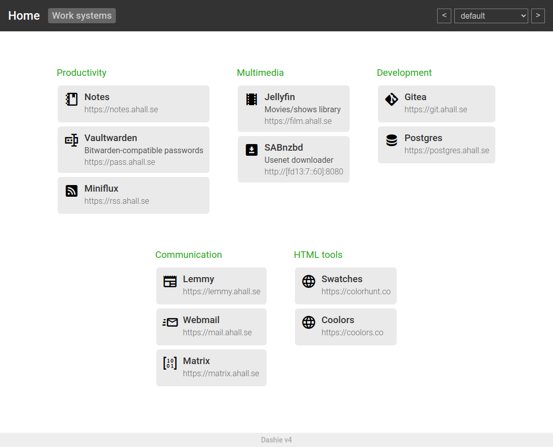
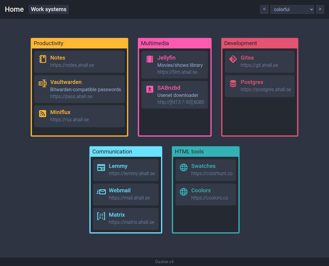
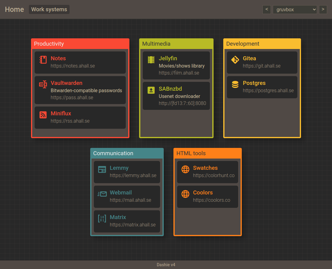
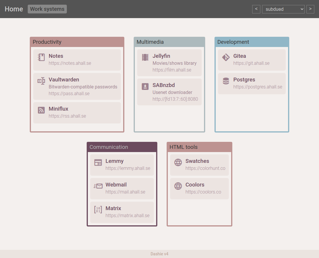
Screenshots
Installation
Copy examples/*.yaml to the web root (or write start.yaml from scratch instead), and put everything on a webserver serving the directory statically.
YAML files
The YAML configuration files have to be edited by hand right now.
In the future dashie is probably going to get a server written in Go, enabling interactive editing and possibly multiuser support.
Dashboard YAML files
Icons use the Material Design Icons library, see https://pictogrammers.com/library/mdi/ for a searchable list of icons. To use the abacus icon, type "abacus" in the icon property of the section items.
Version added here was v7.2.96.
# Pages to be displayed in the header.
# Pages doesn't have be defined here, the file can still be accessed
# by visiting /?page=filename (without .yaml).
# This could be used to create elaborate site hierarchies.

pages:
  - name: start # this has to correspond to the filename.yaml in the web root.
    label: Home

  - name: foo # this would be <web root>/foo.yaml
    label: Foo

page:
  theme: default # name of theme when loading the page, corresponding to the same name in <web root>/themes.yaml.
  label: Home # doesn't have to be the same as the name or label in the pages array.

sections:
  - label: Search
    items:
      - label: Google
        url: https://www.google.com
        icon: google

      - label: DuckDuckGo
        description: '"Privacy, simplified."' # The description field is optional.
        url: https://duckduckgo.com
        icon: duck

  - label: Multimedia
    items:
      - label: Jellyfin
        description: The free software media system
        url: https://jellyfin.org
        icon: filmstrip

      - label: Spotify
        url: https://spotify.com
        icon: music
Themes
The themes.yaml file in the web root has the following format per theme:
gruvbox: # Name of theme.
  page:
    text: "#bdae93" # Color of the page name.
    background: "#282828 url('/images/backgrounds/gruvbox.svg')" # background color/image of the page.
    header: "#504945" # Background color of the header section.
    footer: # Colors for the footer (The 'Dashie v[x]' line).
      show: true # Show or hide the footer.
      text: "#a89984"
      background: "#504945"

  page_select: # Colors for the page boxes.
    text: "#bdae93"
    background: "#3c3836"

  theme_select: # Colors for the theme selector.
    text: "#bdae93"
    background: "#3c3c36"
    border: "#665c54"

  section:
    background: "#504945"
    shadow: "10px 10px 15px 0px rgba(0, 0, 0, 0.25)"
    # These colors will be used in a roundrobin fashion when displaying
    # sections, if a section is not explicitly using a color index.
    # The first is the border color, the second is the section label color.
    borders:
      - ["#fb4934", "#eee"]
      - ["#b8bb26", "#333"]
      - ["#fabd2f", "#333"]
      - ["#458588", "#eee"]
      - ["#fe8019", "#333"]
      - ["#689d6a", "#333"]

  item:
    label: # The label can be left blank to receive the same color as the section border.
    background: "#282828"
    description: "#d5c4a1"
    url: "#a89984"
    icon: # Icon can be left blank, same behaviour as label.
    hover: brighter # Determines mouse pointer hovering over section background color.
                    #Can be brighter, darker or anything else to disable behaviour.


